Breaking Ground on Uni-Fab Automation

At Uni-Fab Automation, innovation is in their DNA. Forged on the shop floor of Uni-Fab, as a trailblazer in the metal fabrication industry, Uni-Fab Automation demanded its unique identity, distinct from Uni-Fab, while still resonating with the cutting-edge world of automation. That’s where we came in. As we set out to build a brand identity that reflects this technological evolution, we were driven by a singular goal: to create a distinctive presence that highlights Uni-Fab Automation’s pioneering spirit in the world of automation.

Follow along as we walk through the design plans for this dynamic new brand.

Breaking Ground on Uni-Fab Automation

The Blueprint: Laying the Foundation

Our mission? To craft a brand identity as forward-thinking and dynamic as their pioneering spirit. 

Or as Adam Zaremba, puts it:

“An exciting, yet challenging project. While this wasn’t necessarily a rebrand – but more of the creation of a new brand, Uni-Fab Automation is an industry leader in fabrication and their development of technology created this totally separate entity that required its own look and personality that fit within the world of automation, distinguishing it as a leader in its own right. We worked closely with executive leadership to identify key business-related opportunities and constraints within market to then translate into building a brand that reflects the values, direction and feel of the brand while standing out from competitors and resonating with clients and target markets.”

Welding Vision to Reality

We dove deep into the world of gears, circuits, and steel. What makes this company tick? How do they stand out in a sea of nuts and bolts? 

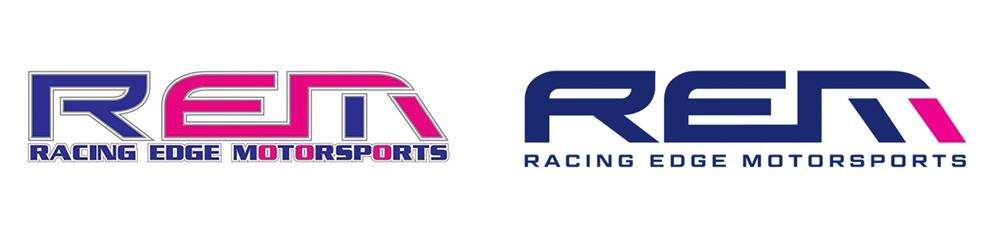
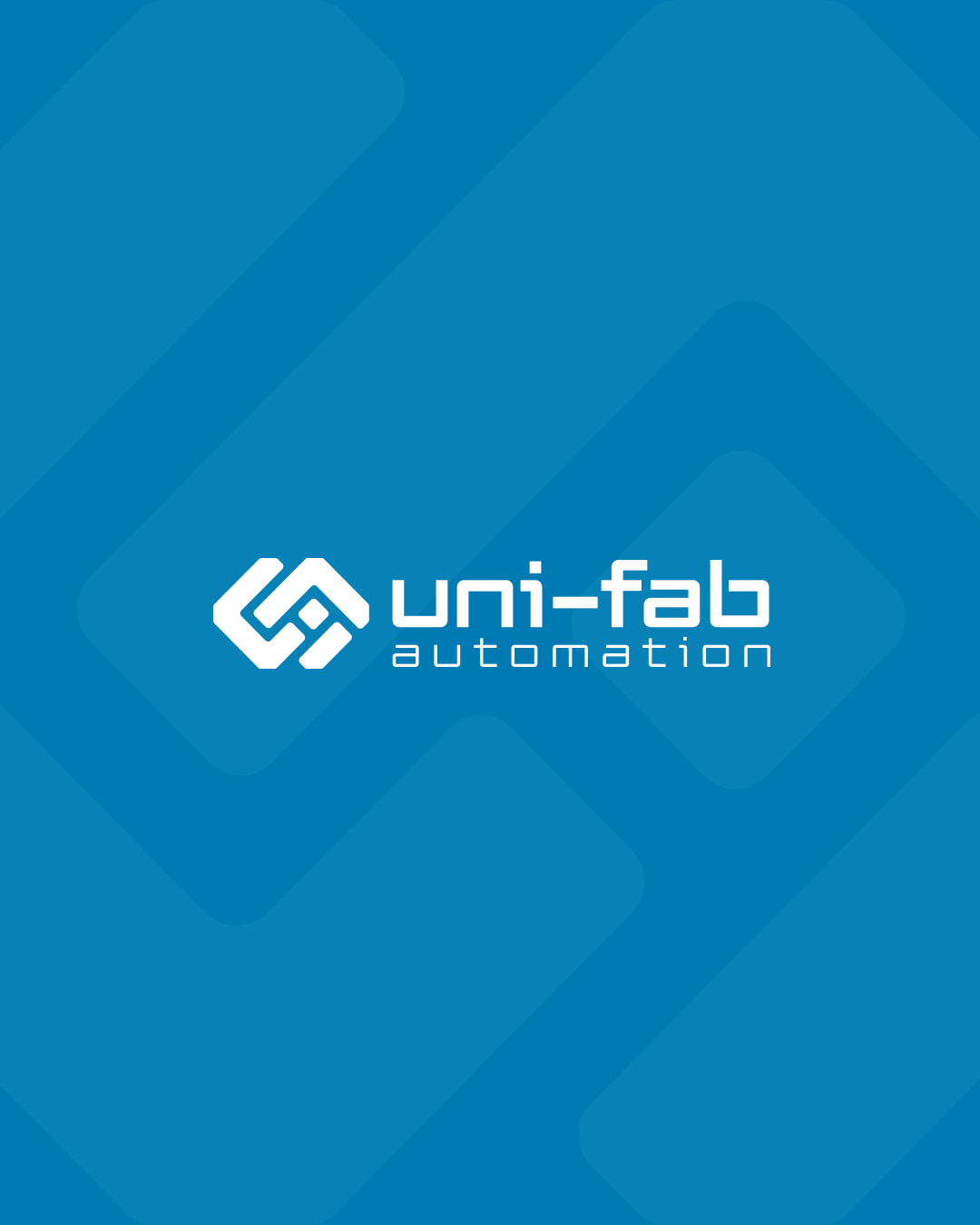
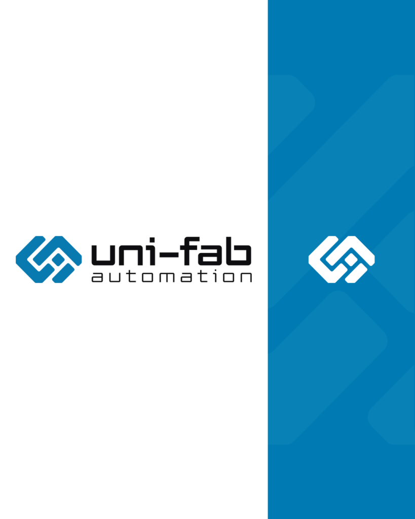
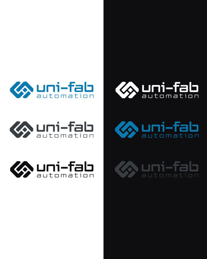
With the blueprint in place, we set to work on designing a logo that would symbolize this bold new chapter. Our goal was to design a symbol that conveys innovation, precision, and leadership in the fabrication industry.

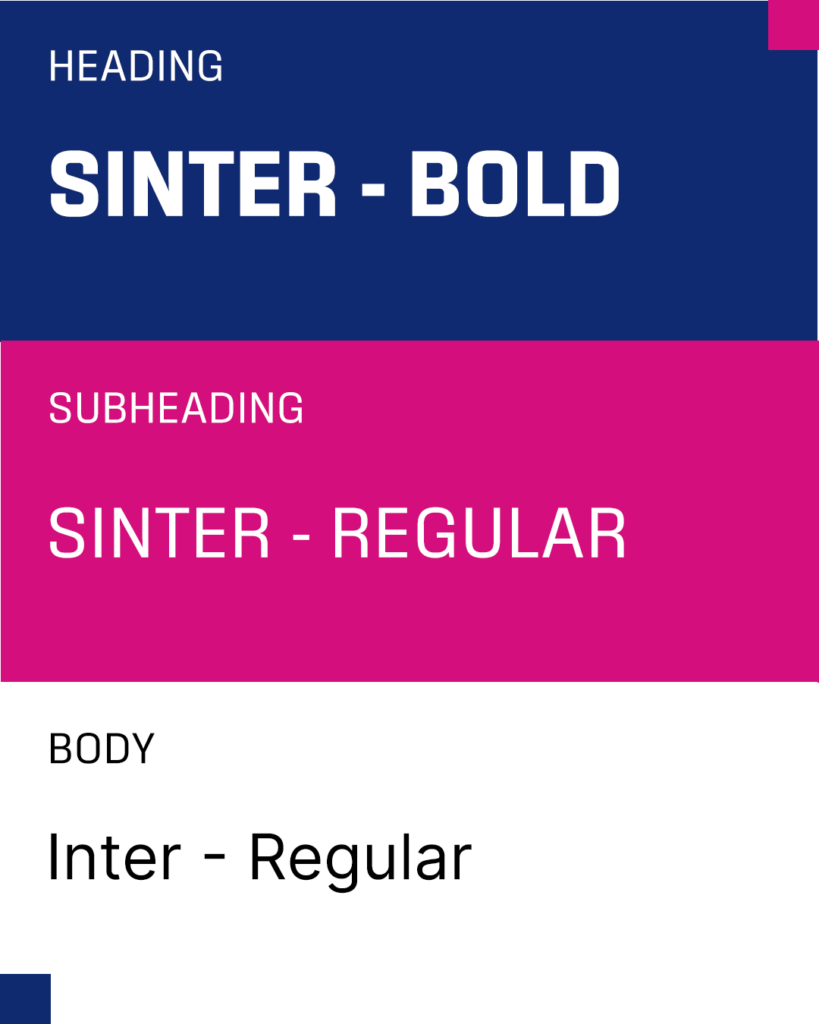
The result? A logo that marries strength with sophistication, a colour palette that screams both industrial might and technological finesse, and typography that’s as precise as a laser cutter. Clean lines and bold geometric shapes capture the essence of Uni-Fab Automation’s technical expertise while the minimalist aesthetic reflects the efficiency and innovation they bring to every project.

We aimed to create a logo that didn’t just sit pretty on paper but stood as a symbol of excellence in the construction industry. 

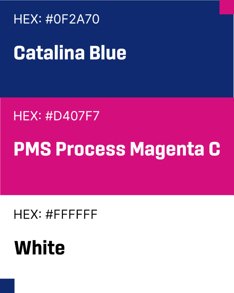
Sparking Up the Colour Palette

Let’s talk colour for a moment. Ever seen a robot blush? Neither have we, but we’ve refined the art of making automation look bold and sophisticated. Uni-Fab Automation’s palette is a visual manifesto of who they are: dynamic, driven, and always pushing boundaries.

To stand apart in an industry dominated by light, clinical tones, we embraced a darker, edgier palette that speaks to strength and innovation. Deep navy anchors the brand, a nod to their established palette, while bold blues signal trust and progress.

It’s sleek, commanding, and unmistakably Uni-Fab Automation.

Capturing the Weld: Video and Photo Collaboration

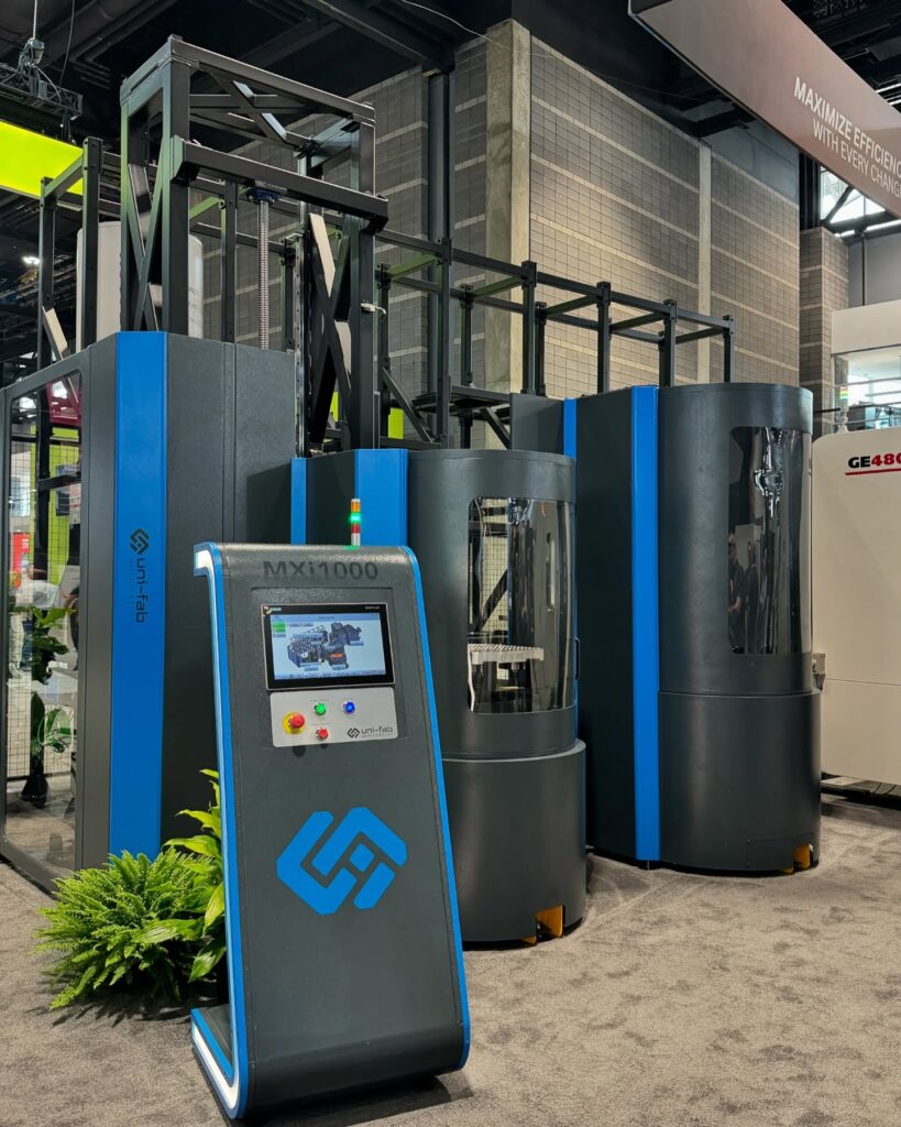
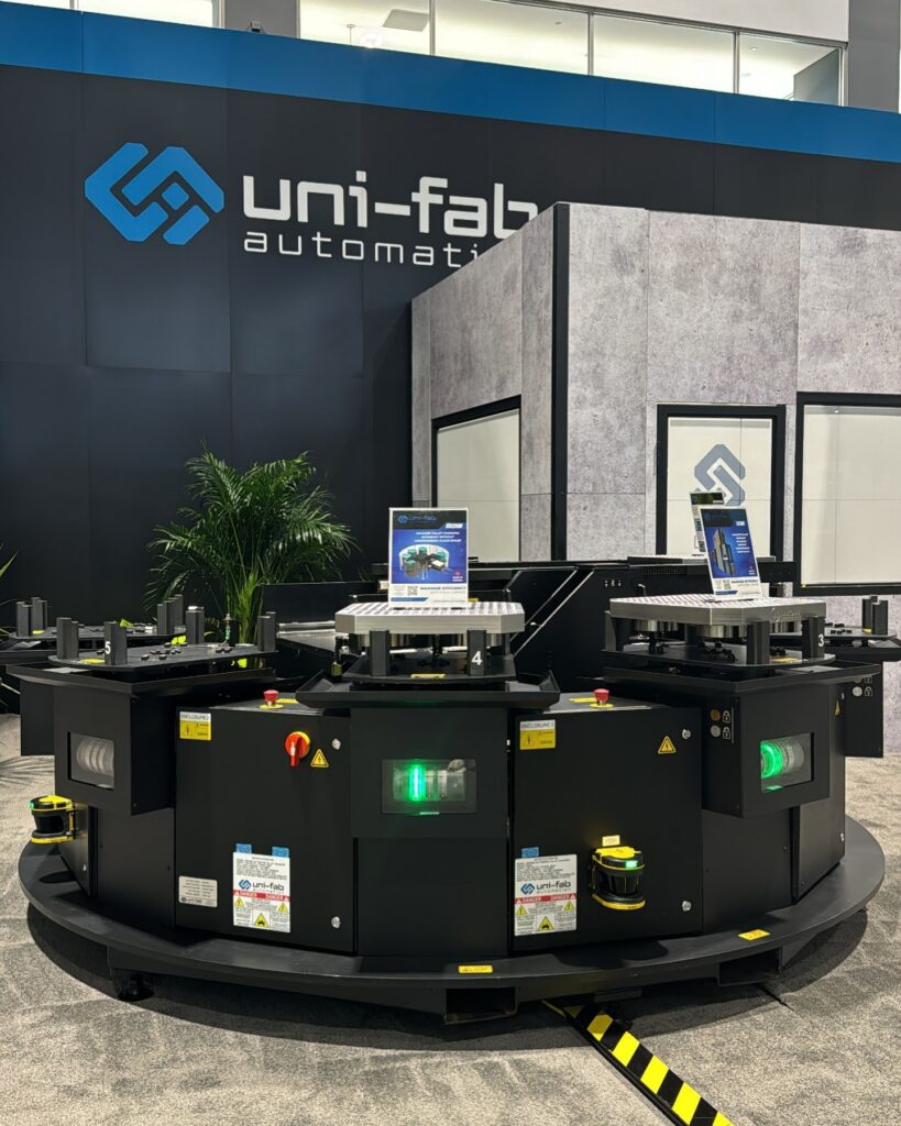
To fully bring Uni-Fab Automation’s story to life, we collaborated with a top-tier video and photo production company to document their products and services. The goal? To capture the spark of innovation that powers every Uni-Fab Automation project. Through high-quality visuals, we showcased their state-of-the-art processes and the meticulous craftsmanship that goes into each custom fabrication.

The resulting images and video content provide a powerful visual narrative that communicates Unifab’s technical expertise and forward-thinking solutions. These assets will be used to bolster their digital presence, marketing materials, and trade show displays, adding depth and dimension to their brand story.

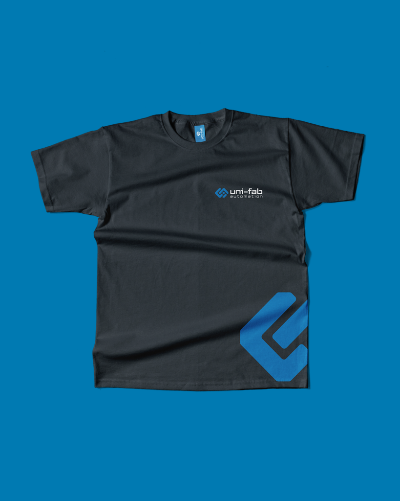
Gearing Up with New Merch

Now came the extra-fun part. How do you dress a brand that lives in both the gritty world of metal and the sleek realm of automation? Our solution: merchandise that workers would proudly wear on the shop floor and execs would confidently sport in boardrooms.

We translated Uni-Fab Automation’s brand into a range of stylish, high-quality merchandise that puts its fresh identity front and center. From sleek, custom-branded tumbler to a stylish polo shirt, each item is crafted to convey the precision and excellence that Uni-Fab Automation’s clients and partners expect from them. 

Now, no matter where they go or what they create, they are driving progress in every stitch, every weld, and every innovation.

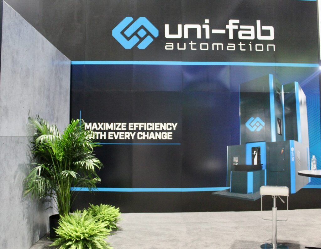
Bolting Down the Details: Trade Show Booth with Automotive Style

The final piece of the puzzle? A trade show booth that’s part art installation, part technological showcase. 

When it came to designing Uni-Fab Automation’s trade show booth, we made sure every detail reflected their identity as leaders in both construction and automotive metal solutions. Inspired by the sleek lines of high-performance vehicles, we created a bold, automotive-style booth that draws visitors in with its dynamic displays and metallic finishes.

Framing the Future

As the dust settles on this whirlwind project, one thing’s clear: we’ve helped develop a brand that’s ready to lead the charge into the future of automation.

Strike while the iron’s hot. Let’s build something awesome together. 

Webflow 101: Start Your Creative Engines

Despite only being a few years younger than its predecessors (Shopify, WordPress), Webflow is definitely the new belle of the ball and (over)taking the internet by storm. The simple reason for this is the new demands of the digital world – things need to be fast, precise, and perform flawlessly…and look nice, and be cost-friendly – and Webflow delivers on all fronts.

Main features:

  • Pixel-perfect design
  • Responsive layouts
  • Creative freedom
  • Technical integrity
  • Reliable security
  • Discreet, clean code generation

Clean code, less development issues, and full creative control? Tell me more.

What’s great:

Powered by AWS, Webflow delivers speed and precision. Users don’t have to worry about load times because everything is built natively, bypassing plugin slowdowns and development issues, resulting in a more secure and stable environment. The built-in CMS simplifies the organization of personalized items like blogs, case studies, portfolios, and more – again, no third-party patches or developer support required. By generating clean code, Webflow is also well equipped from an SEO standpoint and incorporates meta control, schema, and structured content.

What’s not so great:

Despite making items look beautiful online, the functionality of the eCommerce offerings leaves something to be desired, especially for larger or more robust shops. The functionality and lack of integrations falls short of competitors (i.e. Shopify) who offer some processes or features as standard.

So what does this all mean:

In a nutshell, for someone wanting to hit the ground running, Webflow can be strongly considered. If design and detail are paramount, speed to launch is a major factor, or creative control and design freedom, Webflow may just be your tool. Its client-friendly editor allows for fool-proof content updates, and with a bit of help from us, continues adding value through SEO support, performance optimization, and content growth.

In short, Webflow isn’t just a tool—it’s a creative engine. If you’re looking to build beautiful, high-performing websites that are easy to manage and scale, Webflow is a powerful, future-proof platform that delivers on both form and function.

“Webflow’s granular controls of nearly all aspects of development allows us to make any design come to life with ease and the limited maintenance requirements and CMS features that Webflow provides sets it apart from other platforms like WordPress.” Mark DiCarlo, Pure Industries

Crossing the Finish Line with Racing Edge Motorsports

The checkered flag fell on our Racing Edge Motorsports project. We began this project by refreshing their brand and establishing a comprehensive brand guidelines package. Their clean, new look establishes them as champions on and off the track, reinforcing their commitment to building winners.

We built on the brand refresh with a complete overhaul of their website. First, establishing a solid web strategy, which was then synthesized into the design and development of their Webflow-powered website. Since REM is positioned as a complete, performance-driven partner for karting champions and a retailer of motorsports products, they have split their entities into Racing Edge Motorsports (the race team) and Racing Edge Materials (distribution and retail), which allowed us to leverage two separate web platforms: Webflow and Shopify. You can read more about why we love Webflow below and stay tuned for a follow-up article on their eCommerce site, Racing Edge Materials, and why our go-to ecomm platform and all-around business retail solution is Shopify. 

To complete their look, we put together their livery designs for the spring karting season. Their slick new branding, website and karts are now ‘literally’ positioned for the podium and REM is sure to continue creating champions. This was an excellent opportunity to take our clients to the next level with a turn-key business solution and flex our capabilities as both a strategy and design, branding, and web partner. We always look forward to opportunities to elevate our clients and welcome the opportunity to discuss future projects.

Check out the site in action: Racing Edge Motorsports

Brand Refresh: Out With the Old, In With the New

At first glance, it looks like not much has changed but yet everything’s changed. It has been thirteen years since we first created the branding for REM, and thirteen years later, the brand has not deviated from its roots – rather, it has been refined for the modern age. Some minor colour tweaks, font refinements, and a dash of leading to let the letters and words breathe, and now Racing Edge Motorsports is making a statement: they mean business. With the same level of expert coaching and race-proven results drivers have come to know and can trust, REM was proactively setting itself apart. This was a classic example of building on a trusted reputation and brand recognition but striving for excellence and staying ahead of your competition by proactive improvement. The bonus of this branding refresh was to consider the Racing Edge Materials site and ensure there was flexibility to keep a consistent theme across two distinct entities and any future products, services and more.

Behind the Brand

Logo Design: We took the edge off, literally. To modernize the logo, we rounded the edges to make the logo more aerodynamic, cleaned up and simplified the design, made it more distinct-looking, and made some structural changes to carry over into other REM entities, along with design accents. All this was in keeping with their proven pedigree, distinguishing REM as ‘the’ prominent brand accelerating into the future of motorsports.

Colour Palette: We kept things true and adjusted the hue. Catalina Blue, PMS Process Magenta C and White (standard). The unique and bold colours that set the stage for REM live on with the motorsports department.

Typography: We selected Sinter for a crispier and more assertive font. Less futuristic, more business, and exuding confidence.

Merchandise: We also designed t-shirts, race suits, and livery designs to take the clean colour contrast offline and into the real world.

Taking It to the Screens

REM was already recognized for being champions on the track, but they were looking to also take their spot atop the podium in the online racing world. Rewind back to 2012 when we started working with them to refresh and reenergize their visual identity, sharpen their messaging, and align it with their business goals. It was more than just selecting colours…it was about creating awareness for their driver training programs, coaching, engine builds, transportation, and hospitality services. This is where we helped with content development and copywriting services to refine their messaging to ensure it was clear with their vision.

Go With the ‘Flow

We wanted to ensure their website was also sleek and visually stunning, so we built a custom Webflow site. In a digital world where creativity is thriving, Webflow unlocks digital creativity by ditching the template model and building pixel-perfect sites.

Responsiveness, handling, layout…all things a driver considers, and all things we consider when turning a web platform into a creative engine. With a built-in CMS for managing things like their news content, race calendars, media galleries and more, Webflow excels in this case by providing fast, secure hosting with little maintenance. Once frameworks are built, users are able to update content with minimal training. 

Webflow is a great choice to move fast, stand out, and control the narrative – something REM’s clients can appreciate. REM now has a cohesive, modern presence online that is true to who they are and sure to produce championship results – on and off the track. Podium Pwned.

For more information on Webflow and why we love it click here.